

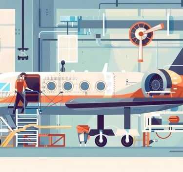
HORIZON AIRLINES
Discover boundless horizons with every flight, where journeys become adventures.
OVERVIEW
Booking a flight should feel like the beginning of an adventure, not a complex task. With Horizon Airlines, we set out to reimagine the airline ticketing experience transforming it from frustrating and outdated to intuitive and empowering.
This project focused on redesigning the Airline Ticketing System’s user interface with one clear goal, to simplify and streamline every step of the booking journey. From initial search to final confirmation, we aimed to eliminate friction, reduce cognitive load and create a flow that feels natural whether you're booking a last-minute getaway or planning a dream vacation.
But we didn’t stop there. Recognizing that travel plans often change, we also reworked how users modify or cancel tickets, making it easy to adapt without stress. With a focus on clarity, control and flexibility, this new interface empowers users to make confident choices throughout their travel experience.
MY ROLE
UX Designer & Researcher
USER RESEARCH
To design a truly user-centered experience, I began by immersing myself in the real-world struggles of travelers.
Through extensive secondary research and a competitive analysis of leading airlines such as Southwest, Emirates and British Airways, I explored how current systems perform and where they fall short. I analyzed user reviews, support forums and industry articles, pulling insights from a wide range of user voices across different demographics and travel needs.
Rather than just documenting pain points, I prioritized the most critical issues and turned them into actionable opportunities. Each challenge uncovered through research directly informed a targeted design decision ensuring Horizon Airlines would deliver an experience that’s not only beautiful, but frustration free and intuitive.
PAIN POINTS
SOLUTIONS
1. Users felt overwhelmed by cluttered layouts and complex visual hierarchy.
2. Users struggled to find flights that fit their specific needs due to limited filters and generic search results
3. The previous booking flow was fragmented and confusing, leading to drop-offs mid-process.
4. Users found it frustrating to make changes or cancellations, with unclear rules and limited control.
1. I introduced a clean, intuitive interface that highlights primary actions and reduces cognitive load. Key information is now front and center, and supporting details are elegantly tucked away creating a more guided, effortless experience.
2. I expanded search capabilities with enhanced filters (e.g., time range, flexible dates, fare type) and added personalization features, making it easier to surface relevant options quickly.
3. I streamlined the booking journey into a step-by-step guided flow, reducing ambiguity and increasing conversion. Each step clearly communicates progress, guides users effortlessly from flight selection to payment.
4. I designed flexible ticket management tools that empower users to modify or cancel bookings with clarity. Transparent policies and simplified UI elements reduce stress and enhance trust.


DESIGN PHASE
COLOURS
TYPOGRAPHY
INFORMATION ARCHITECTURE
DIGITAL WIREFRAMES
USER FLOW
HIGH FIDELITY WIREFRAMES


LANDING PAGE HOME
LANDING PAGE MANAGE
LANDING PAGE CHECK-IN
LANDING PAGE FLIGHT STATUS
HELP
FLIGHT STATUS
FIND MY BOOKING
CHECK-IN
CHECK-IN CONFIRMATION
BOOK FLIGHT DEPARTURE
BOOK FLIGHT RETURN
BOOK FLIGHT CONFIRMATION
PASSENGER & PAYMENT INFORMATION
PAYMENT CONFIRMATION
DEALS
FILTERED DEALS
HORIZON AIRLINES
Discover boundless horizons with every flight, where journeys become adventures.
OVERVIEW
Booking a flight should feel like the beginning of an adventure, not a complex task. With Horizon Airlines, we set out to reimagine the airline ticketing experience—transforming it from frustrating and outdated to intuitive and empowering.
This project focused on redesigning the Airline Ticketing System’s user interface with one clear goal: to simplify and streamline every step of the booking journey. From initial search to final confirmation, we aimed to eliminate friction, reduce cognitive load, and create a flow that feels natural—whether you're booking a last-minute getaway or planning a dream vacation.
But we didn’t stop there. Recognizing that travel plans often change, we also reworked how users modify or cancel tickets, making it easy to adapt without stress. With a focus on clarity, control, and flexibility, this new interface empowers users to make confident choices throughout their travel experience.
MY ROLE
UX Designer & Researcher
USER RESEARCH
To design a truly user-centered experience, I began by immersing myself in the real-world struggles of travelers.
Through extensive secondary research and a competitive analysis of leading airlines such as Southwest, Emirates, and British Airways, I explored how current systems perform—and where they fall short. I analyzed user reviews, support forums, and industry articles, pulling insights from a wide range of user voices across different demographics and travel needs.
Rather than just documenting pain points, I prioritized the most critical issues and turned them into actionable opportunities. Each challenge uncovered through research directly informed a targeted design decision—ensuring Horizon Airlines would deliver an experience that’s not only beautiful, but frustration-free and intuitive.
PAIN POINTS
SOLUTIONS
1. Users felt overwhelmed by cluttered layouts and complex visual hierarchy.
4. Users found it frustrating to make changes or cancellations, with unclear rules and limited control.
3. The previous booking flow was fragmented and confusing, leading to drop-offs mid-process.
2. Users struggled to find flights that fit their specific needs due to limited filters and generic search results
1. I introduced a clean, intuitive interface that highlights primary actions and reduces cognitive load. Key information is now front-and-center, and supporting details are elegantly tucked away—creating a more guided, effortless experience.
2. I expanded search capabilities with enhanced filters (e.g., time range, flexible dates, fare type) and added personalization features, making it easier to surface relevant options quickly.
4. I designed flexible ticket management tools that empower users to modify or cancel bookings with clarity. Transparent policies and simplified UI elements reduce stress and enhance trust.
3. I streamlined the booking journey into a step-by-step guided flow, reducing ambiguity and increasing conversion. Each step clearly communicates progress, guides users effortlessly from flight selection to payment.


DESIGN PHASE
TRPOGRAPHY
COLOURS
INFORMATION ARCHITECTURE
DIGITAL WIREFRAMES
USER FLOW
HIGH FIDELITY MOCKUPS