
Scan & Save
An app that helps users locate products as they shop in person
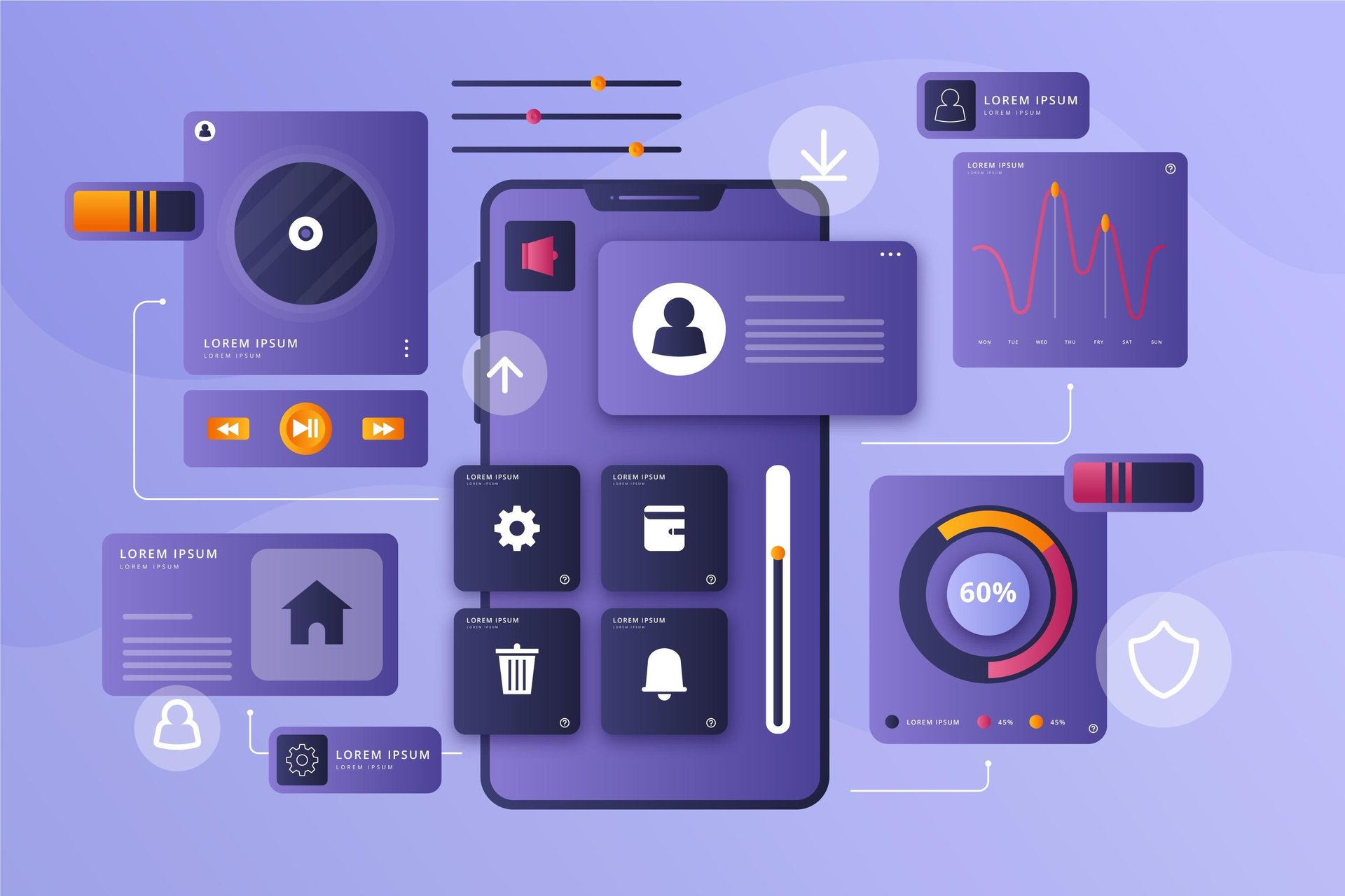
Product Overview
OVERVIEW
Imagine you're in a hurry at the grocery store, but can’t find that one ingredient. Frustrating, right? The Scan & Save App was specifically created to help shoppers quickly find items in-store, eliminating the need to wander around aimlessly. By guiding users efficiently to their products, the app enhances the in-person shopping experience and reduces time spent searching, making grocery runs smoother and less stressful.
MY ROLE
As the UX Designer & Researcher, I led the end-to-end design process from uncovering user pain points through research, to crafting personas, journey maps, wireframes, and interactive prototypes. I also conducted usability testing and iterated on feedback to ensure the final solution was intuitive, efficient, and deeply rooted in real user needs.
USER RESEARCH

I conducted extensive secondary research and a competitive analysis of Jewel-Osco and Whole Foods Market to uncover common user frustrations with grocery shopping apps during in-person visits. By analyzing articles, reviews, and research papers, I identified key pain points and uncovered the diverse needs and expectations of users. I then prioritized the most critical issues and translated them into targeted design solutions that directly addressed user challenges within the app.
PAIN POINTS
SOLUTIONS
1. Difficulty locating products in-store, leading to wasted time and frustration during shopping trips.
2. Mismatch between in-app product listings and real-world items, making it hard for users to identify the exact products they see on shelves.
3. Lack of visibility into daily offers and discounts, causing users to miss out on deals while shopping.
4. Inability to save frequently purchased items, making it inconvenient for regular users to plan and repeat their grocery runs efficiently.
1. Real-time product location: Users can easily locate items in-store using Aisle numbers displayed in the app, reducing time spent searching.
2. Barcode scanner for quick access:
A built-in barcode scanner allows users to scan any product and instantly view its details and availability within the app.
3. Dedicated deals page:
A clearly labeled “Deals” page helps users discover exclusive offers and daily discounts, enhancing their savings while shopping.
4. Save for later list:
Users can conveniently save frequently purchased items by tapping the heart icon, making future grocery runs faster and more personalized.
DEFINE PHASE: UNDERSTANDING THE USER
By analyzing user research, I developed personas and user journey maps to represent the goals, behaviors, and pain points of key user groups. These artifacts helped me maintain a clear, user-centered focus throughout the design process and guided every decision I made.
PERSONAS
Problem Statement
Problem Statement
Problem Statement
Problem Statement
Elliot is a passionate cook who needs an app that provides personalized recommendations, special offers, and discounts. He often struggles to locate specific ingredients in-store, wasting valuable time during his shopping trips.
Leah is a doctor who needs an app that provides detailed dietary information for products, as she values a healthy and quality lifestyle. She struggles to find clear, trustworthy nutritional data while shopping, making it harder to stick to her health-conscious choices.
Zareen is a student who needs an app that offers an efficient and stress-free shopping experience. She often struggles with wasting time searching for products and needs a solution that helps her quickly find what she’s looking for, allowing her to manage her busy schedule without the added stress of shopping.
Carlos is a small business owner who needs an app with a barcode scanning feature to quickly access product information. He values efficiency and needs a solution that helps him shop swiftly, saving time while ensuring he makes informed purchasing decisions.
USER JOURNEY MAPS
Goal: To easily find products using the app's personalized recommendations, special offers, and discounts based on individual preferences and shopping habits.
Goal: To easily find products through the app based on specific dietary needs and personalized recommendations that align with health and lifestyle preferences.
Goal: To easily find products by scanning barcodes and complete a fast, efficient checkout process.
COLOURS
After understanding the user pain points and goals, I focused on designing the main user flow. The goal was to create intuitive pathways that addressed the challenges we’d identified. For Elliot, I streamlined access to personalized recommendations, and for Zareen, I ensured quick navigation to products to save time and reduce stress. The user flow became a roadmap, guiding users seamlessly from frustration to satisfaction and ensuring a smooth experience across the app.
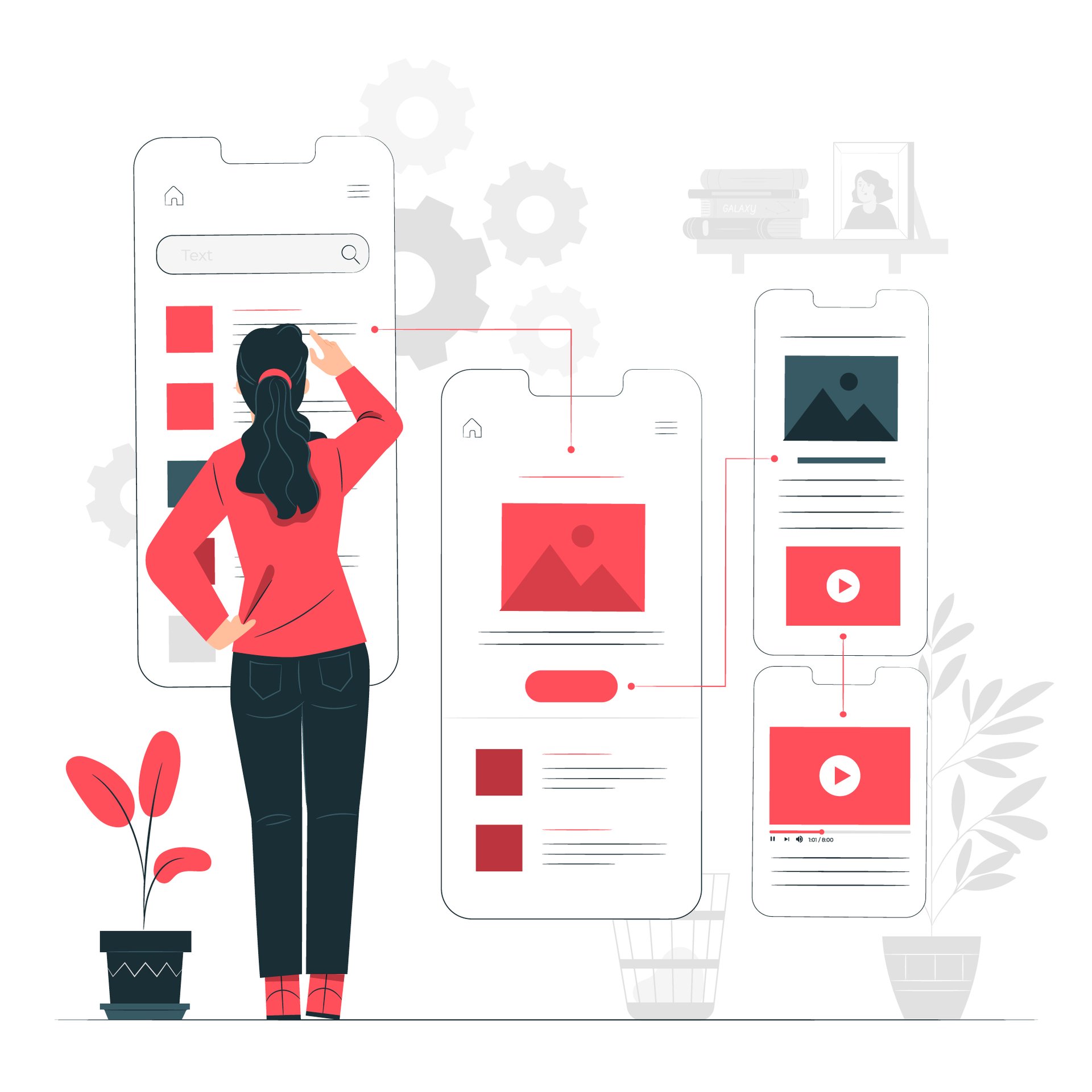
DESIGN PHASE : MAPPING OUT THE USER JOURNEY
TYPOGRAPHY
INFORMATION ARCHITECTURE
DIGITAL WIREFRAMES
USER FLOW
USABILITY TESTING
I conducted the first round of usability testing with friends to gather initial feedback. Following that, I ran a second round of testing with strangers in a university library, which provided fresh perspectives and insights from users unfamiliar with the app.
Round 1 : Key Findings
Round 2 : Refining the Experience
No Payment Page: Users were unsure how to proceed after checkout due to the absence of a payment page.
Missing Confirmation Page: Without a confirmation page, users felt uncertain whether their order was about to be processed.
Incorrect Labeling: The list page was labeled “Cart” instead of “List,” causing confusion about where to find shopping items.
Payment Page Issue: The payment page was still missing, disrupting the flow of the checkout process.
Add Payment Management Screen: A screen was added to the accounts page, allowing users to manage payment methods directly.
Easy Cart Access: Buttons were added to both the list page (to access the cart) and the checkout page (to return to shopping), improving navigation and user flow.
HIGH FIDELITY WIREFRAMES
Welcome
SignIn
Register
Home
Shop
Account
List
Deals
Search
Scan
Cart
Confirmation
Payment
Checkout
ACCESSABILITY CONSIDERATIONS
Keyboard Navigation: The app supports seamless keyboard navigation, allowing users to easily move between elements using the tab key. The carefully defined element order ensures an intuitive experience, enabling efficient interaction without the need for a mouse. This design specifically caters to users who rely on keyboard navigation, providing a convenient and accessible interface.
Strategic Icon Placement: The app is designed with careful attention to icon placement, ensuring a visually appealing and intuitive interface. In key areas, such as the navigation bar, both icons and text are used together to enhance clarity and guide users through the app seamlessly. This approach improves efficiency and creates a more enjoyable experience for all users
High Contrast Design: The app is designed with high contrast sensitivity in mind, featuring a white background and an orangey-red font for optimal visibility and readability. This color scheme meets the minimum contrast ratio, enhancing accessibility and ensuring a user-friendly experience for everyone.
IMPACT : Final Thoughts and Key Takeaways
The design effectively addresses critical user pain points, including product location, barcode scanning, personalized recommendations, and special offers. User acceptance testing confirmed that users appreciated the app's features and color theme, while offering valuable feedback for future improvements.
Scan & Save
An app that helps users locate products as they shop in person
PRODUCT OVERVIEW
OVERVIEW
Imagine you're in a hurry at the grocery store, but can’t find that one ingredient. Frustrating, right? The Scan & Save App was designed to solve exactly that — helping shoppers quickly locate items in-store without wandering aimlessly. By guiding users efficiently to their products, the app enhances the in-person shopping experience and reduces time spent searching, making grocery runs smoother and less stressful.
MY ROLE
As the UX Designer & Researcher, I led the end-to-end design process — from uncovering user pain points through research, to crafting personas, journey maps, wireframes, and interactive prototypes. I also conducted usability testing and iterated on feedback to ensure the final solution was intuitive, efficient, and deeply rooted in real user needs.
USER RESEARCH
I conducted extensive secondary research and a competitive analysis of Jewel-Osco and Whole Foods Market to uncover common user frustrations with grocery shopping apps during in-person visits. By analyzing articles, reviews, and research papers, I identified key pain points and uncovered the diverse needs and expectations of users. I then prioritized the most critical issues and translated them into targeted design solutions that directly addressed user challenges within the app.
PAIN POINTS
1. Difficulty locating products in-store, leading to wasted time and frustration during shopping trips.
4. Inability to save frequently purchased items, making it inconvenient for regular users to plan and repeat their grocery runs efficiently.
3. Lack of visibility into daily offers and discounts, causing users to miss out on deals while shopping.
2. Mismatch between in-app product listings and real-world items, making it hard for users to identify the exact products they see on shelves.
SOLUTIONS
1. Real-time product location: Users can easily locate items in-store using Aisle numbers displayed in the app, reducing time spent searching.
4. Save for later list:
Users can conveniently save frequently purchased items by tapping the heart icon, making future grocery runs faster and more personalized.
3. Dedicated deals page:
A clearly labeled “Deals” page helps users discover exclusive offers and daily discounts, enhancing their savings while shopping.
2. Barcode scanner for quick access:
A built-in barcode scanner allows users to scan any product and instantly view its details and availability within the app.
DEFINE PHASE: UNDERSTANDING THE USER
By analyzing user research, I developed personas and user journey maps to represent the goals, behaviors, and pain points of key user groups. These artifacts helped me maintain a clear, user-centered focus throughout the design process and guided every decision I made.
PERSONAS
Elliot is a passionate cook who needs an app that provides personalized recommendations, special offers, and discounts. He often struggles to locate specific ingredients in-store, wasting valuable time during his shopping trips.
PROBLEM STATEMENT
PROBLEM STATEMENT
Leah is a doctor who needs an app that provides detailed dietary information for products, as she values a healthy and quality lifestyle. She struggles to find clear, trustworthy nutritional data while shopping, making it harder to stick to her health-conscious choices.
PROBLEM STATEMENT
Carlos is a small business owner who needs an app with a barcode scanning feature to quickly access product information. He values efficiency and needs a solution that helps him shop swiftly, saving time while ensuring he makes informed purchasing decisions.
PROBLEM STATEMENT
Zareen is a student who needs an app that offers an efficient and stress-free shopping experience. She often struggles with wasting time searching for products and needs a solution that helps her quickly find what she’s looking for, allowing her to manage her busy schedule without the added stress of shopping.
USER JOURNEY MAPS
Goal: To easily find products using the app's personalized recommendations, special offers, and discounts based on individual preferences and shopping habits.
Goal: To easily find products through the app based on specific dietary needs and personalized recommendations that align with health and lifestyle preferences.
Goal: To easily find products by scanning barcodes and complete a fast, efficient checkout process.
DESIGN PHASE
MAPPING OUT THE USER JOURNEY
After understanding the user pain points and goals, I focused on designing the main user flow. The goal was to create intuitive pathways that addressed the challenges we’d identified. For Elliot, I streamlined access to personalized recommendations, and for Zareen, I ensured quick navigation to products to save time and reduce stress. The user flow became a roadmap, guiding users seamlessly from frustration to satisfaction and ensuring a smooth experience across the app.
COLOURS
TYPOGRAPHY
SITE MAP
DIGITAL WIREFRAMES
Welcome
SignIn
Register
Home
Shop
Scan
Search
Deals
List
Account
Cart
Checkout
USER FLOW
USABILITY STUDY : FINDINGS
I conducted the first round of usability testing with friends to gather initial feedback. Following that, I ran a second round of testing with strangers in a university library, which provided fresh perspectives and insights from users unfamiliar with the app.

ROUND 1


ROUND 2
No Payment Page: Users were unsure how to proceed after checkout due to the absence of a payment page.
Incorrect Labeling: The list page was labeled “Cart” instead of “List,” causing confusion about where to find shopping items.
Missing Confirmation Page: Without a confirmation page, users felt uncertain whether their order was about to be processed.
Payment Page Issue: The payment page was still missing, disrupting the flow of the checkout process.
Easy Cart Access: Buttons were added to both the list page (to access the cart) and the checkout page (to return to shopping), improving navigation and user flow.
Add Payment Management Screen: A screen was added to the accounts page, allowing users to manage payment methods directly.